

Theming
Choose from a variety of themes or develop your own theme easily.
Architecture
PrimeFaces is a design agnostic library so unlike other UI libraries it does not enforce a certain styling such as material or bootstrap. In order to achieve this, styling has been separated into core and theme. Core resides inside PrimeFaces to implement the structure of the components such as positioning whereas theme brings the colors, paddings and margins.
Built-in Themes
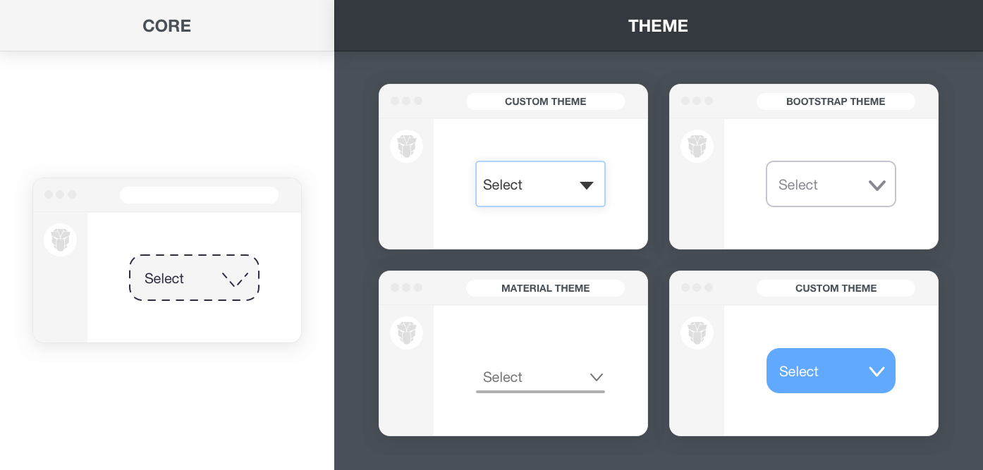
PrimeFaces ships with three free themes to choose from named saga (default), vela and arya. Even more themes such as material and bootstrap are available at primefaces-sass-theme repository at github. For a live preview of themes, use the configurator to switch themes.
A theme is configured by setting the primefaces.THEME context parameter.
<context-param>
    <param-name>primefaces.THEME</param-name>
    <param-value>arya</param-value>
</context-param>
Custom Theme
Themes are created with SASS using the primefaces-sass-theme project available at github. This repository contains all the scss files for the components and the variables of all open source themes so that you may customize an existing theme or create your own. The scss variables used in a theme are available at the SASS API documentation.
There are 2 alternatives to create your own theme. First option is using the Visual Editor and second one is compiling a theme with sass using the primefaces-sass-theme repository.
Visual Editor
Visual Editor is an easy way to quickly customize an existing theme without dealing with the details of the SASS API. The editor allows changing common settings like primary color for built-in themes. Once you have completed the design, click the download button to access the generated theme.css file and import it to your project as an asset. See the Apply Theme section below for details.
Theme SCSS
The theme scss is available as open source at primefaces-sass-theme repository. The theme-base folder contains the theming structure of the components, themes under themes folder import the base and define the SCSS variables. The themes folder also contains all the built-in themes so you can customize their code as well.
To create your own theme, download the release matching your PrimeFaces version and access the themes/mytheme folder. You may also choose another theme like material or bootstrap as your base. The sass variables to customize are available under the variables folder. The _fonts file can be used to define a custom font for your project whereas the optional _extensions file is provided to add overrides to the components designs. The theme.scss file imports the theme files along with the theme-base folder at the root to combine everything together. Next step would be compilation of the scss that can either be command line or within your project with a maven plugin.
Once your theme is ready run the following command at the root of the primefaces-sass-theme project to compile it as css.
mvn dart-sass:compile-sass
Apply Theme
Give a name to your theme e.g. mycooltheme then copy and import the generated theme.css file in your application to WEB-INF/resources/primefaces-mycooltheme/theme.css and finally set the primefaces.THEME context parameter. The primefaces- prefix is required to distinguish the resources as a theme.
    <context-param>
        <param-name>primefaces.THEME</param-name>
        <param-value>mycooltheme</param-value>
    </context-param>
If you'd like to package the theme in a jar file for reuse it in more projects, the location of the theme should be at the WEB-INF/resources/primefaces-mycooltheme/theme.css path folder inside a jar.