
Theming
Choose from a variety of themes or develop your own theme easily.
Architecture
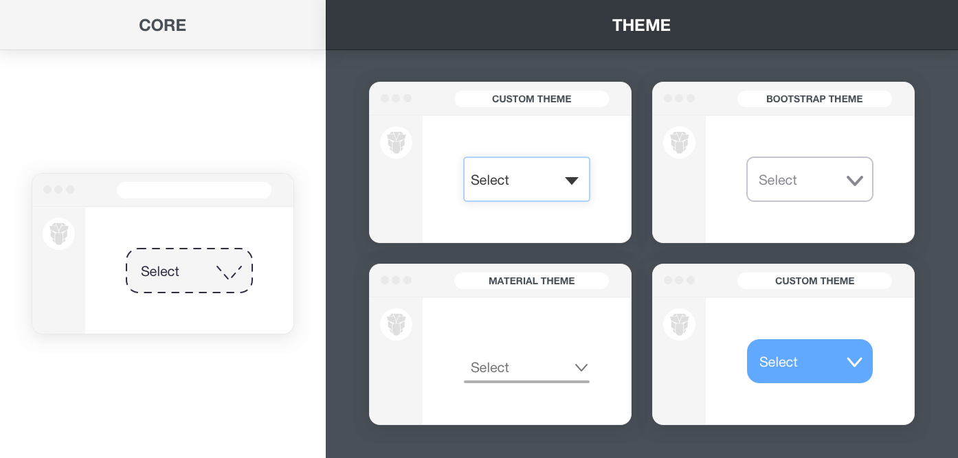
PrimeFaces is a design agnostic library so unlike other UI libraries it does not enforce a certain styling such as material or bootstrap. In order to achieve this, styling has been separated into core and theme. Core resides inside PrimeFaces to implement the structure of the components such as positioning whereas theme brings the colors, paddings and margins.
Themes
PrimeFaces offers various free themes and premium themes along with premium templates that provide an application layout as well. All the free themes are built with the Theme Designer and the npm package brings the CSS output of the theme whereas SCSS is kept as a premium feature in the designer. This means free themes are open source and for customization with SASS, a designer license needs to be acquired.
Customization
CSS of the themes share the same license as PrimeFaces which is MIT, this means the generated CSS can be customized per your needs however this should be avoided if your customizations are not simple. For instance even to change a primary color, since there is no variable a find and replace should be performed various times. On the other hand, this can be achieved by changing a single variable e.g. $primaryColor. Visit the SASS API for the documentation of available customization options.
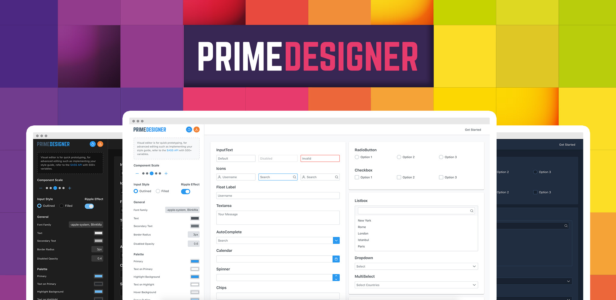
Designer is the ultimate tool to create your own PrimeFaces experience powered by a SASS based theme engine with 500+ variables and a Visual Designer. PrimeFaces only ships the generated CSS of Saga, Vela, Arya and legacy themes whereas Designer provides full access to the whole SASS structure and the variables of these pre-built themes for easier customization.
Whether you have your own style guide or just need a custom theme, Designer API is the right tool to design and bring them to existence.
Visit Designer API HomePage for more information and live demos.