OrderList

OrderList is used to sort a collection via Drag and Drop based reordering, transition effects, pojo support, theme support and more.

Documentation

Basic OrderList

  • San Francisco
  • London
  • Paris
  • Istanbul
  • Berlin
  • Barcelona
  • Rome

Pojo Support with Clip Effect, Captions, Custom Content, Reorder Controls, Events and Responsive

Available
  • nova-lightNova-Light
  • nova-darkNova-Dark
  • nova-coloredNova-Colored
  • luna-blueLuna-Blue
  • luna-amberLuna-Amber
  • luna-greenLuna-Green
Cities
  • San Francisco
  • London
  • Paris
  • Istanbul
  • Berlin
  • Barcelona
  • Rome
Themes
Nova-Light
Nova-Dark
Nova-Colored
Luna-Blue
Luna-Amber
Luna-Green
<h:form>
    <p:growl id="msgs" showDetail="true" skipDetailIfEqualsSummary="true" />

    <h3 style="margin-top: 0">Basic OrderList</h3>
    <p:orderList value="#{orderListView.cities}" var="city" controlsLocation="none" itemLabel="#{city}" itemValue="#{city}" />
    <p:commandButton value="Submit" update="displayCities" oncomplete="PF('cityDialog').show()" style="margin-top:5px" />

    <h3>Pojo Support with Clip Effect, Captions, Custom Content, Reorder Controls, Events and Responsive</h3>
    <p:orderList value="#{orderListView.themes}" var="theme" itemValue="#{theme}" converter="#{themeConverter}" controlsLocation="left" responsive="true">
        <p:ajax event="select" listener="#{orderListView.onSelect}" update="msgs"/>
        <p:ajax event="unselect" listener="#{orderListView.onUnselect}" update="msgs"/>
        <p:ajax event="reorder" listener="#{orderListView.onReorder}" update="msgs"/>

        <f:facet name="caption">Available</f:facet>

        <p:column style="width:40px">
            <h:graphicImage name="showcase/images/themeswitcher/themeswitcher-#{theme.name}.png" alt="#{theme.name}" styleClass="ui-theme"/>
        </p:column>

         <p:column>
            <h:outputText value="#{theme.displayName}" />
        </p:column>
    </p:orderList>
    <p:commandButton value="Submit" update="displayThemes" oncomplete="PF('themesDialog').show()" style="margin-top:5px" />

    <p:dialog modal="true" showEffect="fade" hideEffect="fade" widgetVar="cityDialog" header="Cities" width="200">
        <p:dataList id="displayCities" value="#{orderListView.cities}" var="city">
            <h:outputText value="#{city}" />
        </p:dataList>
    </p:dialog>

    <p:dialog modal="true" showEffect="fade" hideEffect="fade" widgetVar="themesDialog" header="Themes" width="200" id="dlgThemes">
        <h:panelGrid id="displayThemes" columns="2">
            <ui:repeat value="#{orderListView.themes}" var="theme">
                <h:outputText value="#{theme.displayName}" style="margin-right:5px" />
                <br />
            </ui:repeat>
        </h:panelGrid>
    </p:dialog>
</h:form>

FREE THEMES

Built-in component themes created by the PrimeFaces Theme Designer.
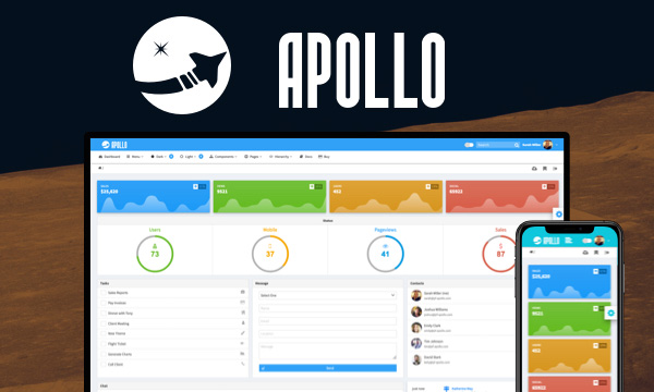
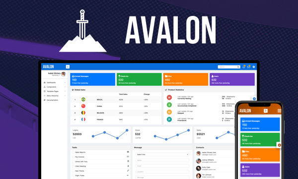
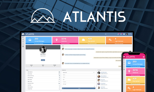
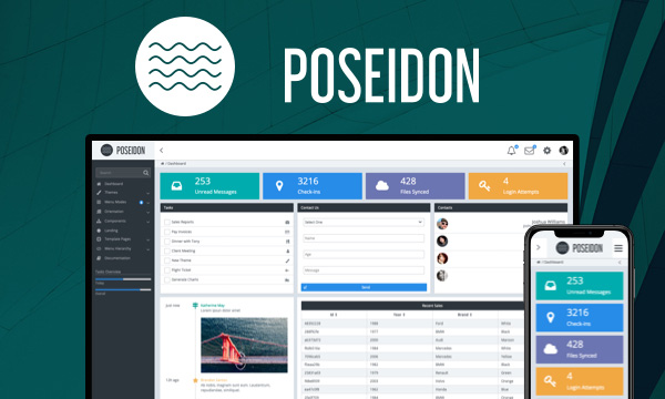
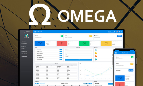
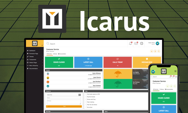
nova-light Nova-Light
nova-dark Nova-Dark
nova-colored Nova-Colored
luna-blue Luna-Blue
luna-amber Luna-Amber
luna-green Luna-Green
luna-pink Luna-Pink
omega Omega

PREMIUM TEMPLATES

Create awesome applications in no time using the premium templates and impress your users.