SelectBooleanCheckbox

SelectBooleanCheckbox is used to select a boolean value.

Documentation
Basic
Ajax
Values
Value 1: false
Value 2: false
<h:form>
    <p:growl id="msg" />

    <h:panelGrid columns="1" style="margin-bottom:10px" cellpadding="5">
        <p:selectBooleanCheckbox value="#{selectBooleanView.value1}" itemLabel="Basic"/>

        <p:selectBooleanCheckbox value="#{selectBooleanView.value2}" itemLabel="Ajax">
            <p:ajax update="msg" listener="#{selectBooleanView.addMessage}" />
        </p:selectBooleanCheckbox>
    </h:panelGrid>

    <p:commandButton value="Submit" icon="pi pi-check" update="display" oncomplete="PF('dlg').show()" />

    <p:dialog header="Values" modal="true" resizable="false" showEffect="fade" widgetVar="dlg">
        <h:panelGrid columns="1" id="display">
            <h:outputText value="Value 1: #{selectBooleanView.value1}" />
            <h:outputText value="Value 2: #{selectBooleanView.value2}" />
        </h:panelGrid>
    </p:dialog>
</h:form>

FREE THEMES

Built-in component themes created by the PrimeFaces Theme Designer.
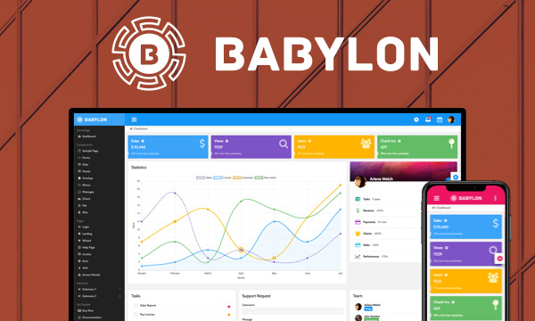
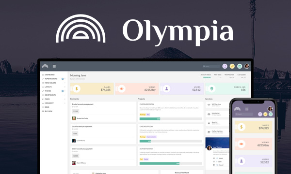
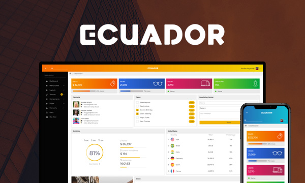
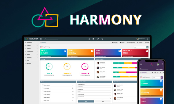
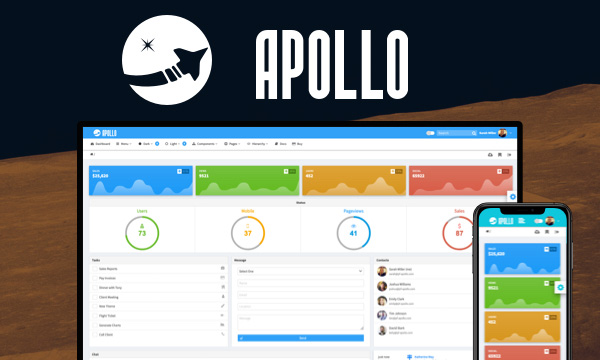
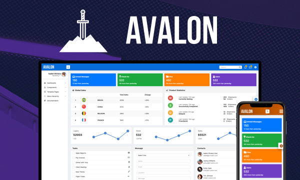
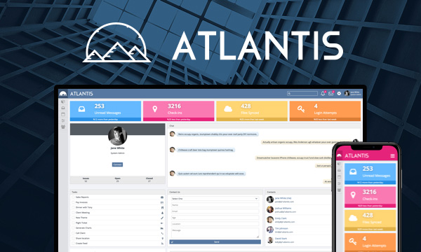
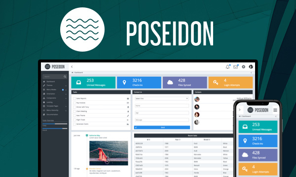
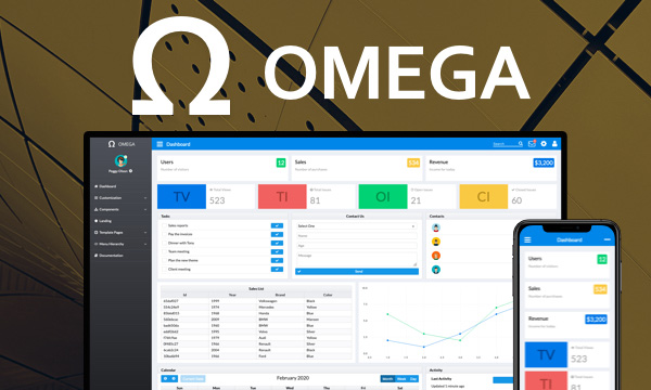
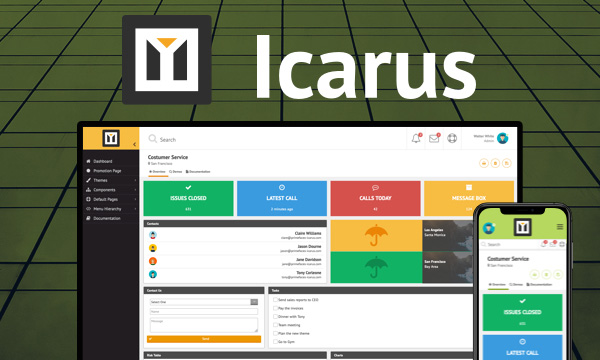
nova-light Nova-Light
nova-dark Nova-Dark
nova-colored Nova-Colored
luna-blue Luna-Blue
luna-amber Luna-Amber
luna-green Luna-Green
luna-pink Luna-Pink
omega Omega

PREMIUM TEMPLATES

Create awesome applications in no time using the premium templates and impress your users.