DefaultCommand - Multiple

DefaultCommand controls which command to initiate form submit with when enter key is pressed. Multiple defaultCommand in same form is supported with scope option. Within a Textarea the defaultCommand is not active.

Documentation
Panel 1

Panel 2

<h:form id="form">
    <p:growl>
        <p:autoUpdate />
    </p:growl>

    <p:panel header="Panel 1" id="panel1">
        <p:panelGrid columns="2" layout="flex" columnClasses="p-col-4, p-col-8" styleClass="ui-fluid ui-noborder">
            <h:outputLabel for="name" value="Name"/>
            <p:inputText id="name" value="#{defaultCommandView.text}" />

            <h:outputLabel for="textarea" value="Textarea"/>
            <p:inputTextarea id="textarea" value="#{defaultCommandView.text2}" />
        </p:panelGrid>
    </p:panel>

    <br/>

    <p:panel header="Panel 2" id="panel2">
        <p:panelGrid columns="2" layout="flex" columnClasses="p-col-4, p-col-8" styleClass="ui-fluid ui-noborder">
            <h:outputLabel for="otherInput" value="Other input"/>
            <p:inputText id="otherInput" />
        </p:panelGrid>
    </p:panel>

    <br/>

    <p:commandButton value="Button1" id="btn1" action="#{defaultCommandView.btn1Submit}" />
    <p:commandButton value="Button2" id="btn2" action="#{defaultCommandView.btn2Submit}" />

    <p:defaultCommand target="btn1" scope="panel1" />
    <p:defaultCommand target="btn2" scope="panel2" />
</h:form>

FREE THEMES

Built-in component themes created by the PrimeFaces Theme Designer.
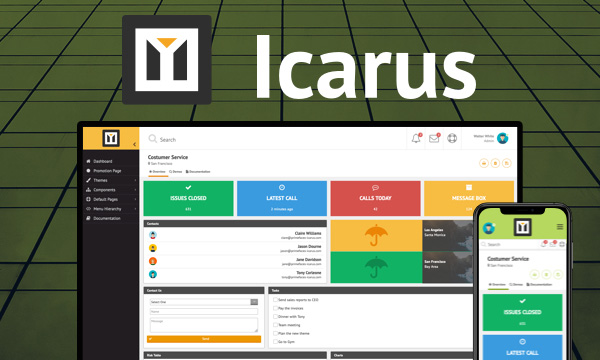
nova-light Nova-Light
nova-dark Nova-Dark
nova-colored Nova-Colored
luna-blue Luna-Blue
luna-amber Luna-Amber
luna-green Luna-Green
luna-pink Luna-Pink
omega Omega

PREMIUM TEMPLATES

Create awesome applications in no time using the premium templates and impress your users.